

Walmart is a multinational retail corporation that operates a chain of hypermarkets, grocery stores, and discount department stores. Walmart is known for its affordable prices and its wide selection of products. To keep up with the constantly evolving e-commerce landscape, Walmart decided in 2017 to update their design system to support brands and create a consistent and responsive experience across all devices.
I was working at Sapient Razorfish, now Publicis Sapient, as a Senior Art Director when Walmart approached us with the primary challenge to take their concept designs and make a design system that is responsive across five breakpoints, including the product page, the cart, brand pages, category pages and more. The design system needed to be flexible and scalable to accommodate future design changes.
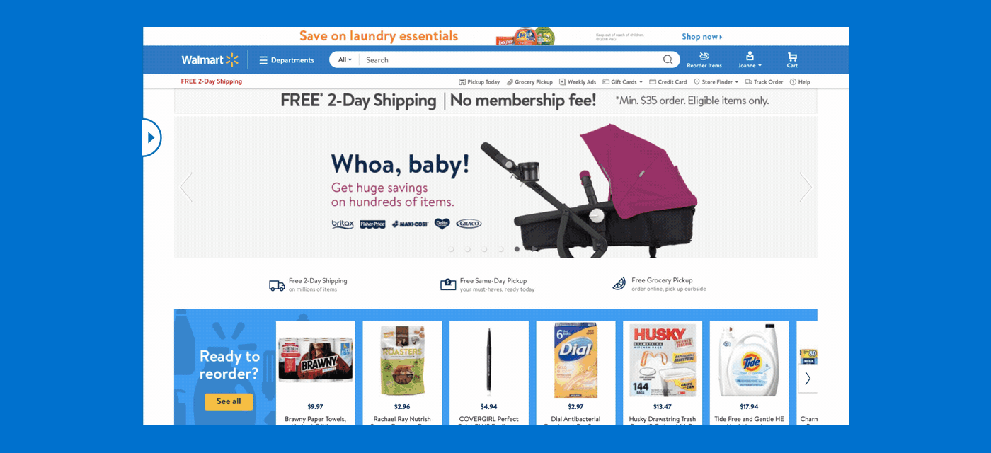
Old vs new design for walmart.com
To create a responsive design system for Walmart, we started with thoroughly reviewing their branding guidelines and researched the concept designs provided by Walmart. We analyzed the designs to identify common design patterns and components that could be reused across the various breakpoints.
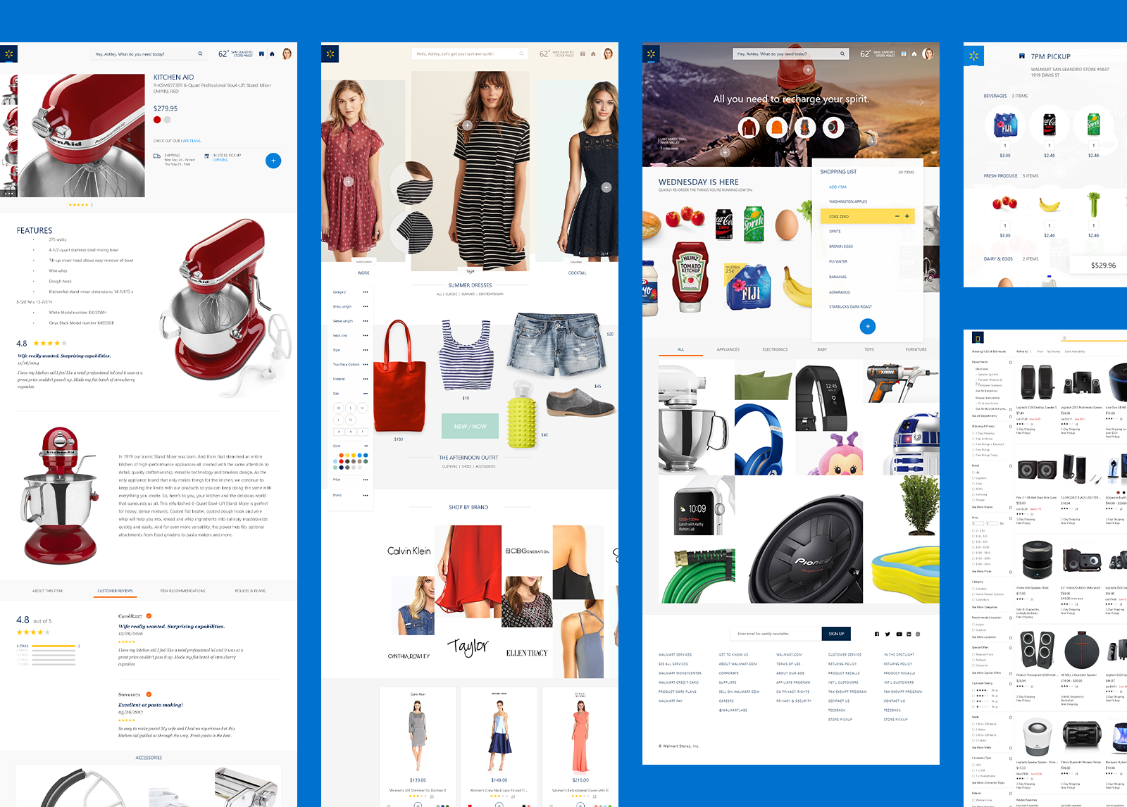
Concepts provided to convert into a design system
After we identified the following design patterns and components and created a design system that included the following:
• Design Guidelines - We created design guidelines that outlined the typography, color palette, and iconography to be used throughout the design system.
• Component Library - We created a component library that included all the common design patterns and components identified during the analysis phase.
• Responsive Grid System - We created a responsive grid system that allowed us to create layouts that were optimized for each breakpoint.
• Design Templates - We created design templates for each of the five breakpoints for the product page, the cart, brand pages, search, browse, ERO, and category pages.
• Design Review - We conducted design reviews with Walmarts CEO Marc Lore as well as stakeholders and executives to ensure that the design system met their requirements and was consistent with their brand.
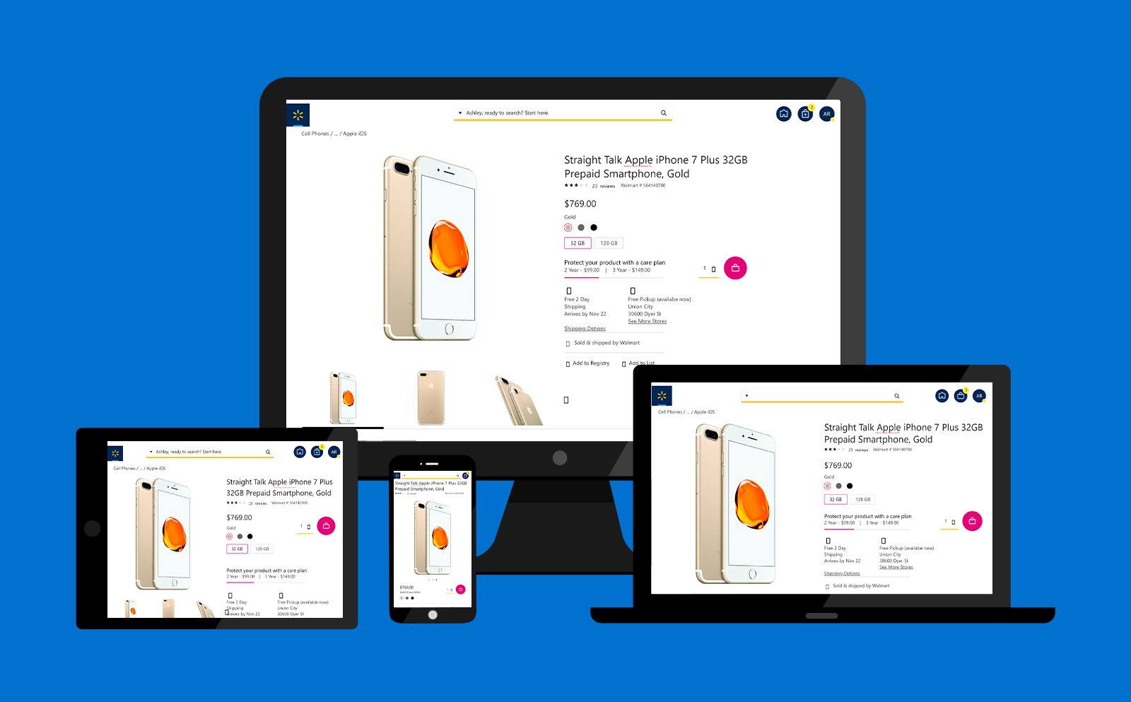
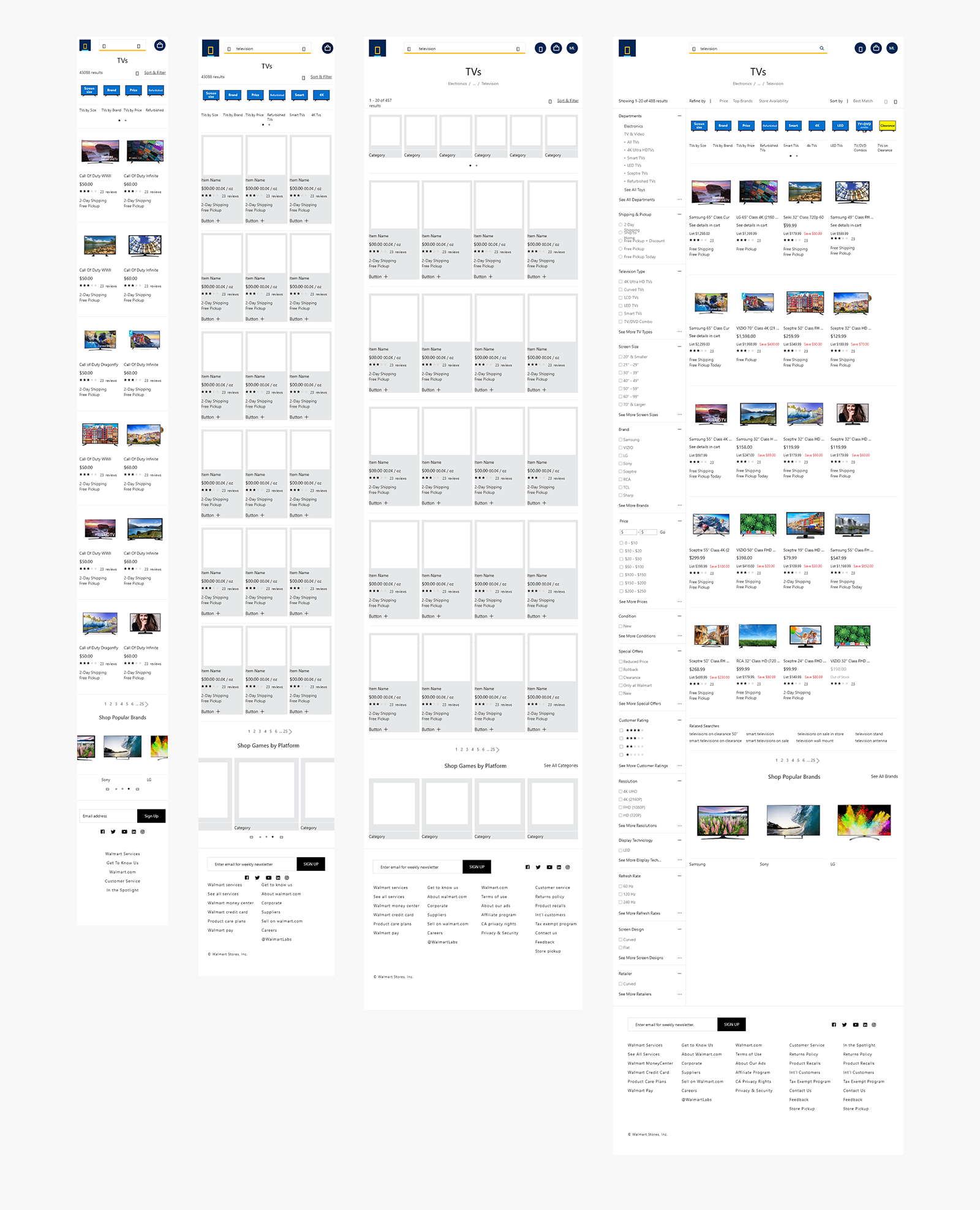
Responsive designs handed off to Walmart
Converting concept designs to be responsive for Walmart was a success. We were able to deliver designs on time with a consistent and responsive experience across all devices, making it easier for customers to browse and purchase products on Walmart.com. The concepts and handoff were all made in Adobe XD. The design system was also flexible and scalable, making it easy to accommodate future design changes.

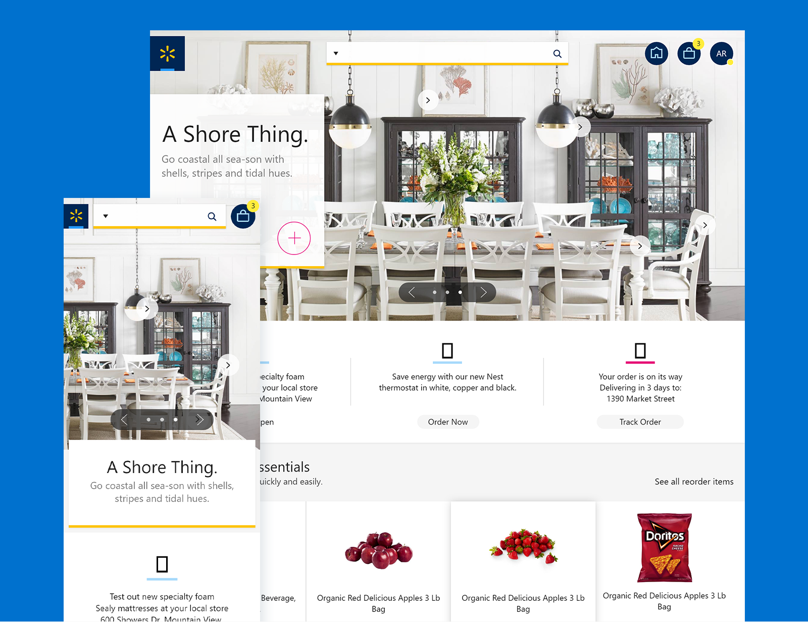
Illustrations I did as a last min request from Walmart
Overall, the new design system helped Walmart improve the user experience and increase customer satisfaction. There was alot to learn from the release, specifically how users want to utilize Walmart.com and how Walmart can deliver a more personalized experience to users.
Here are some links to articles related to the work done:
• PRINTMAG - Strategic Implications from Walmart.com’s Redesign
• GMA - You can now buy designer fashion for less with new Lord & Taylor, Walmart collab
• TechCrunch - Walmart to launch a more personalized, redesigned website in May
• BusinessInsider - Here's how Walmart's new site may revive its online sales

I’m a digital creative with 15 years experience hopping between San Francisco and New York.
Proficient in Illustrator, Photoshop, Figma, and Premiere. Native speaker of all things front end.
Skillsets focused in UX/UI, product design, branding & illustration, and front-end development with an expertise in responsive code. I also dabble in video/audio editing.
I'm an ice cream swirl of strong communication and limitless creativity which culminates in a tasty experience catered to the right audience.
Outside of my design work, my passions are piloting airplanes, working on my chop at table tennis, engaging in various design activities, and riding my Vespa.